I was given a design challenge to create an application for college students to help college students stay organized by reminding them of upcoming classes and assignments due. The actions required for this project were:
- The student can easily see how much time remains before the next class, as well as where the class takes place.
- The student can see what to-dos are due, as well as add new to-dos.
- The student can check off to-dos.
Research
I began this project by researching some products that already exist to see how they have solved this problem. A lot of them were very agenda focused and could get really into the weeds with their solutions. I also checked out Dribbble to for more creative style ideas since these college apps are pretty outdated and not inspiring in that sense.
It wasn’t difficult to get into the mind of the user since I was a college student and had these difficulties myself. I occasionally would consult my husband who had a different college experience than me, as well as my sister who is currently getting her MBA.

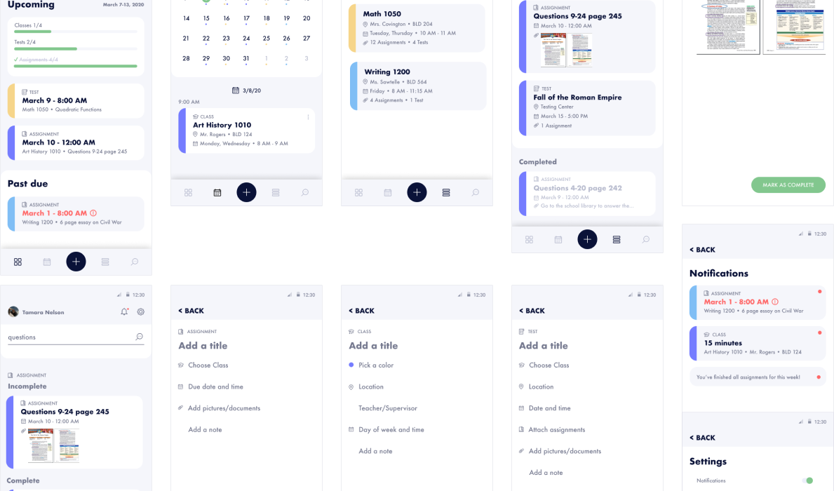
Wireframes
As I was creating these wireframes, a lot of different ambitious ideas came up that were creating a lot of problems to solve, so I tried to keep it simple and staying within scope/time restraint. The goals I wanted to hit were:
1. Quickly see upcoming classes/assignments/test AND be notified about them
2. Manage your class schedule
3. Organize and add assignments, tests, and classes
I decided the Home would be a place that would show what was coming up for today and the near future. Also, the focus would be more on the times and dates rather than the content of what was due. I included a little progess graph so that the user could easily see their accomplishments and what they had left for the week (and possibly feel good by seeing that full progress bar). I wanted to keep the Home simple with three categories (“today”, “upcoming”, “past due”) since I can imagine that this page can get really filled up fairly quickly.
Since the Home is only showing a very linear view of just the week’s events, I added a Calendar for visibility into the future past the week.
The Schedule (initially I called it planner, but then changed it) is where you can see all of your classes, what assignments and tests are attached to them and make any edits. You can expand on classes for more information as well as each assignment and test.
I also included a Search function so there is the ability to just jump to whatever you want quickly.

Mockups
I wanted to make sure that each class was easily identifiable, so when adding a class, you assign a color to it. Another thing that I wanted to make sure was clear is that each card is clear of what category (class, test, assignment) it’s assigned too. I added an icon along with the text label to associate an image with it and hopefully identify it quicker.
I kept a fairly neutral palette because of the amount of colored labels being used, I didn’t want app colors to become distracting.
Notifications have a place to view within the app, but in this hypothetical, this app would also be using native notifications with it. In the settings page, I added some customization to let the user get notifications however they please.

Prototype
If you’d like to see this project in action, check out the prototype here.