There were some issues with the old ReCharge logo that needed to be addressed, such as:
– Inconsistent line thickness and illegible details in the mark
– Uneven font weight in the logotype
– The logotype itself
Some simple changes to the logo were needed and executed to refresh the logo without making it look completely different or unrecognizable.
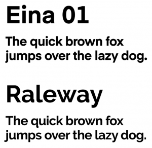
This also led to changing our main fonts around the website and the product. The original font used was called Raleway, which was a very generic and had a lot of issues (especially with numbers). A lot of research and testing lead us to choose Eina 01 and Roboto as the fonts to replace Raleway.

This whole project was a collaboration between the product designer and I, so that it would be a smooth change across all channels.